ClinicMind’s practice management dashboards transform raw data into actionable insights. With enhanced visualization, financial transparency, and patient visit analysis, the new update helps clinics make faster, data-driven decisions across scheduling, billing, and patient engagement.
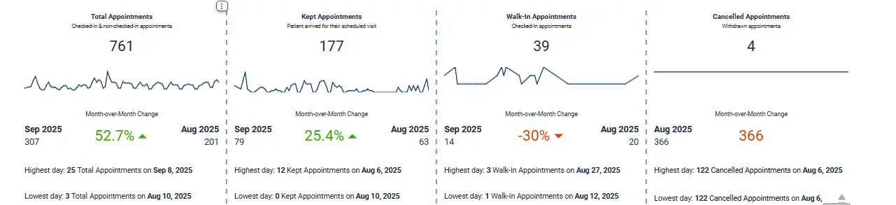
The Practice Overview Dashboard now features timeline charts and directional change indicators, giving users a quick sense of how their key performance indicators (KPIs) are trending month-over-month. Whether it’s patient appointments, collections, or clinician productivity, users can instantly see growth rates, dips, or areas needing attention all without leaving the main view.
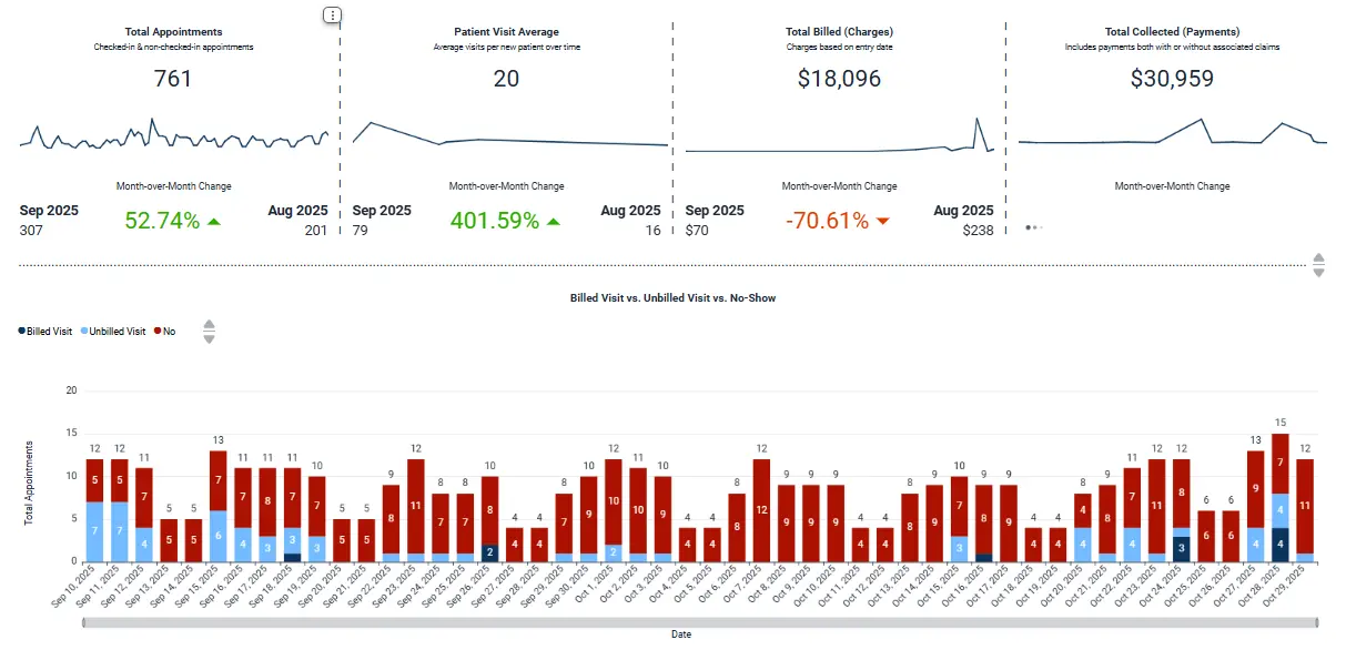
We’ve replaced the older appointment status line chart with a stacked bar format for better readability and quicker pattern recognition.
Each bar now shows the composition of billed visits, unbilled visits, and no-shows, helping users identify gaps between patient engagement and revenue capture.
The update also adds highest and lowest day callouts so practices can quickly spot operational peaks and valleys, enabling better staffing and scheduling decisions.
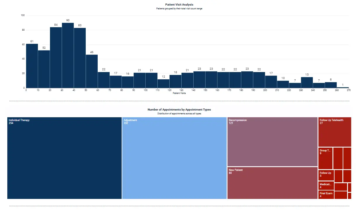
Instead of showing only the first five visits per patient, the new Patient Visit Analysis breaks patients into visit-count “buckets,” making it easier to see how engagement evolves over time.
Complementing this is a tree-map visualization of appointment types providing an at a glance breakdown of which services (like Individual Therapy, Adjustments, or Decompression) drive the most volume.
These updates turn what used to be raw data into a clear story of patient retention, engagement, and care frequency.

The updated financial dashboards separate Insurance vs. Patient Payments more clearly, with both pie and bar charts showing collection distribution and trends over time.
We’ve also introduced a primary-payer vs. payment source breakdown making it easy to see which payers contribute the most to your revenue stream and where patient-side balances are growing.
The result: a unified financial view that helps clinics track performance, identify payer bottlenecks, and plan revenue recovery strategies with precision.
Behind the scenes, we’ve optimized how data loads cutting down wait times even when displaying large, multi-practice datasets.
Each dashboard retains its dynamic filters (Practice, Date Range, and Time Interval), but now processes queries more efficiently for a smoother experience. This improvement means faster transitions between metrics, quicker report exports, and overall better usability for daily operational reviews.
Every chart, KPI, and trend line in the new update has one goal: to help your team understand your practice’s performance at a glance.
From patient flow and clinician productivity to billing efficiency and payment mix the redesigned dashboards make it easy to move from insight to action in seconds.
This update isn’t just a visual refresh it’s a performance upgrade. By combining clarity, speed, and context, ClinicMind’s enhanced dashboards empower practice owners, administrators, and clinicians to make confident, data-driven decisions every day.
Your data just got easier to read and far more powerful.
